Shopify blog




At Shopify, our goal has always been to make it as easy as possible for your customers to buy from your online store. For years we’ve provided our merchants with a simple and secure online checkout that, to date, has processed over $5 billion in sales for hundreds of thousands of individual businesses.
But the web is constantly changing. So today, we’re excited to announce the launch of Responsive Checkout, a brand new ecommerce checkout experience for online stores.
Responsive Checkout is the result of mobile-first thinking and is designed to help you capture more sales – allowing you to spend more time running your business and less time chasing abandoned carts.
It’s a product born out of thousands of hours of usability research and millions of dollars in real transactions carried out by stores using our early release version.
A beautiful checkout, on any device.
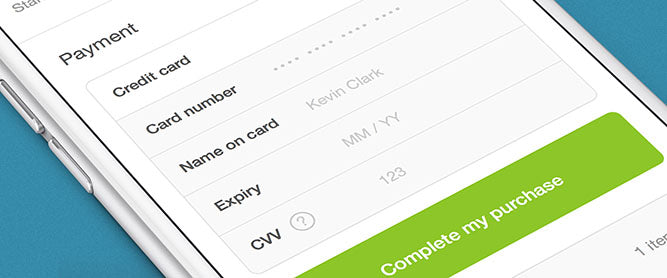
With over 50% of traffic to ecommerce sites now coming from smart phones and tablets, it’s more important than ever that your online store and checkout use responsive design practices.
Responsive Checkout adapts to display a layout optimized specifically for the screen size that your customer is using. For example, on mobile devices where screen real estate is limited, the order summary shifts from the right of the screen to the bottom of the page. This helps your customers complete their purchase faster and with less tedious scrolling, ultimately resulting in more orders for your store.
These days people are buying from you at work on their laptop, from the couch on their tablet, or on-the-go from their phone. With Responsive Checkout you can rest easy knowing they are getting the best checkout experience possible.
Intelligently built. Painstakingly optimized.
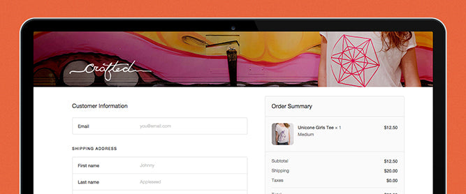
When you want to buy something online, there's nothing worse than having to fight your way through a poorly designed checkout page.
With Responsive Checkout, we carefully considered every detail of the buying process to make it as frictionless as possible. Our goal? To create the world’s most conversion optimized checkout experience.
The project kicked off well over a year ago. We began by conducting hundreds of in-person usability tests and research on how people buy online. We then worked with a select group of merchants, running hundreds of A/B tests, iterating and improving on the Responsive Checkout design. The result is a deceptively simple, one-page checkout flow that provides your customers with a clear and easy path to purchase.
We think you and your customers are going to love the simplicity and ease of use Responsive Checkout provides. One merchant, who saw their checkout conversion rate jump from 58% to 65% using Responsive Checkout told us that this change will result in over ten thousand dollars more revenue this year alone.
A checkout designed for your brand.
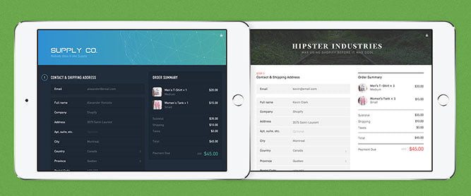
When a customer reaches your checkout, the purchase experience should feel seamless and connected to the shopping experience they just had on your store.
With the introduction of Responsive Checkout, every Shopify online store now comes with easy design controls that give you powerful options for customizing the look of your checkout page. No design or coding skills required.
You can easily upload your own custom header image or edit the background color, add your logo and add a tagline. You can also customize your checkout’s primary, accent, and call-to-action colors to match your brand. International stores can also translate the page’s content into the language of their choice.
And of course, with Responsive Checkout your business is protected by best-in-class, Level-1 PCI compliant security – the same security used by large banks around the world.
All existing Shopify merchants can now preview and upgrade to Responsive Checkout in their admin dashboard starting today, while new Shopify stores will have it enabled automatically.
Read more
- Your Friendly Neighborhood Pen Shop- How Phidon Pens and Shopify Capital Took a Local Favorite to the Next Level
- How Do I Understand My Store’s Revenue and Expenses?
- How Wood Wood Toys Uses Shopify Inbox to Differentiate and Win Sales
- How Frostbeard Studio’s Creative Duo Avoided the “Burnout” of Shipping Orders Themselves
- Introducing Store Checkout On Your Own Business Domain
- How Shopify Fulfillment Network Brings 2-Day Delivery to Your Store
- How Ondo's Customers Using Shop Pay Installments Are Spending 2x More Than Regular Customers
- Hybrid Fulfillment- A Solution for Fast, Flexible Growth
Responsive Checkout FAQ
What is responsive checkout?
Responsive checkout is a purchase flow that automatically rearranges its layout to match the screen size a shopper is using, whether that's a phone, tablet, or laptop. On smaller screens, elements like the order summary move to a more accessible position on the page instead of staying in a fixed sidebar. This keeps the buying steps clear and reduces the scrolling needed to complete a purchase.
How do I turn on responsive checkout for my store?
Existing merchants can preview and upgrade to responsive checkout directly from their admin dashboard, with no developer work required. New stores have it enabled automatically from the start, so there's nothing extra to set up. Merchants who want to see the change before switching can preview the layout first and roll it out when ready.
What is the average cart abandonment rate for online checkouts?
Online shoppers abandon their carts at a rate of just under 70% on average across ecommerce sites. According to data collected by the Baymard Institute, the average ecommerce cart abandonment rate is just under 70%. Complex checkout flows, hidden costs, and limited payment options are common drivers of this drop-off, which is why a fast, uncluttered checkout matters for recovering otherwise-lost sales.
What mobile checkout mistakes cause shoppers to abandon their cart?
Long or complicated checkout flows are a leading cause of mobile drop-off. 18% of users have abandoned a cart because of checkout complexity. Forced account creation and slow-loading pages also push mobile shoppers away, since small screens and touch keyboards leave little patience for extra steps. Cutting unnecessary form fields and offering guest checkout options address most of these friction points.
Does responsive checkout work the same way on every device?
Responsive checkout displays a layout built specifically for the device it detects, rather than showing one fixed design everywhere. Shoppers see an experience tailored to their screen whether they're checking out at a desk, on a couch with a tablet, or on a phone while out. The underlying purchase steps stay consistent, only the arrangement of elements on the page adjusts.