Shopify blog


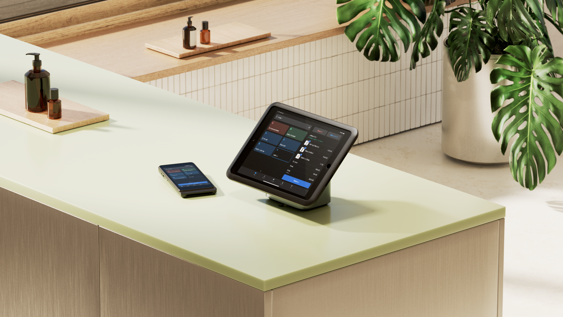
A retail storefront makes a first impression before a shopper enters the store or clicks on a product.
Storefront design connects online discovery with in-person retail. Physical stores still matter in 2026, while it’s the digital touchpoints that often shape whether a shopper visits, browses, or buys.
In Salsify’s 2025 Consumer Research report, 72% of shoppers said they had researched a product online and then bought it in a physical store within the last year.
This guide explains what a storefront includes today and how storefront design is changing as shopping behavior shifts across channels.
What is a storefront design?
Storefront design is the practice of building each physical and digital entry point to a brand so it captures attention and prompts action. A strong storefront design connects curb appeal with click appeal across every customer touchpoint.
In physical spaces, storefront design includes window displays, retail signage, entryway design, lighting, and store layout.
Online, it includes a homepage hero section, Google Business Profile, and social storefronts on platforms like Instagram and TikTok Shop.
The core principles of effective storefront design
- Clarity
- Transparency and trust
- Consistency in branding
- Accessibility and inclusion
- Emotional connection
- Continuous evolution
- Evidence-driven design
These seven principles help physical and online storefronts communicate clearly and create consistent experiences:
Clarity
Clarity involves how quickly the storefront explains itself. According to 2024 wayfinding research, visibility and readable environmental cues are part of how people orient themselves in built spaces.
In retail terms, that puts pressure on signs, windows, and product packaging to communicate offers without making people work for it.
Transparency and trust
Transparency is the most studied storefront factor in current retail research. A 2025 Journal of Retailing study found that greater exterior transparency increases perceived informativeness and the likelihood of consumer entry.
When people can see more of the store from the sidewalk, they have more information to judge whether it’s worth entering.
Consistency in branding
A storefront has to be easy to recognize. A 2025 review of brand-logo research describes logos as symbols that communicate identity and support brand recall.
In practice, repeated colors, logo treatments, and visual cues make the storefront easier to recognize before a customer reads a word.
Accessibility and inclusion
Accessibility changes whether people can comfortably approach, interpret, and use a storefront.
Research on sensory inclusivity in retail environments from 2025 identifies barriers such as sensory overload, navigation difficulties, and communication barriers in brick-and-mortar stores.
This means accessibility is part of good storefront design, not a layer added later.
Emotional connection
Retail design also sets the atmosphere before the full store experience begins.
A 2025 field study at a fashion retailer found that a pleasant atmosphere had direct positive effects on purchase intentions, revisit intentions, and satisfaction.
Exterior design, lighting, materials, and display choices all contribute to that first emotional read.
Continuous evolution
Physical retail space is not static. A 2024 review of fashion retail customer experience describes the physical store as an environment that continues to change in response to customer expectations and broader retail shifts.
Storefront design has to change with merchandising, seasonality, and how the store wants to present itself in the market.
Evidence-driven design
Every storefront decision should connect to outcomes you can measure.
Track metrics like dwell time, click-throughs, or conversions, then refine based on what works. Data closes the loop between design intent and business impact.
12 storefront design strategies to attract customers
- Define your brand story and vision
- Use lighting to create mood and focus
- Design clear and compelling signage
- Create an inviting entrance and clear view
- Build dynamic window and product displays
- Leverage color psychology to evoke emotion
- Keep your design fresh with seasonal themes
- Engage the senses (sound, scent, touch)
- Ensure your storefront is accessible to all
- Create a seamless digital storefront experience
- Maintain brand consistency online and offline
- Use analytics to measure impact
Use these 12 principles from architecture, psychology, and merchandising to turn casual interest into sales:
1. Define your brand story and vision
Start with your brand story.
Your storefront is your retail brand in physical form. If that story isn’t clear, your aesthetic choices can turn into guesses instead of clear business decisions.
Write a single sentence that states your brand promise. For example, “We make outdoor gear for people who fix rather than replace.”
Then turn that sentence into visual choices. That might mean a reclaimed-wood facade, an earthy palette, and a product repair bench. Carry it through every touchpoint including your window displays, signage, and website’s copy.
Notice how SeaBags applies this concept to their flagship store in Portland, Maine. The brand makes products from recycled sailcloth, which is reflected throughout the store with a reclaimed buoy wall and recycled sail display.
2. Use lighting to create mood and focus
Retailers layer lighting to guide attention and set the tone.
Use three layers:
- Ambient lighting: To provide overall brightness.
- Task lighting: To illuminate areas where shoppers read labels or try products.
- Accent lighting: To highlight specific products.
To set up store lighting:
- Use warm ambient light at the entryway; keep the brightness level high enough to read packaging
- Add targeted light at mirrors, fitting rooms, and checkout counters to make labels and textures visible
- Aim narrow beams at one focal table or mannequin near the entrance; keep the surrounding area dimmer to create contrast
- Check bulbs and lenses every week; replace flickering lamps and wipe dust from tracks
3. Design clear and compelling signage
Signage has three purposes: decoration, branding, and wayfinding. It should tell shoppers what the store sells and when it’s open, helping them decide whether to enter.
Follow these practices:
- Visual hierarchy. Start with the store name, followed by the category and a tagline. Apply this hierarchy to window signs and digital displays.
- Legible design. Use large sans-serif fonts, high contrast, and matte finishes to prevent glare. Keep digital messaging concise so customers can scan it from a distance.
- Sign placement. Position signs perpendicular to the façade and at eye level in the entryway. Use nearby signs to extend visibility beyond the storefront.
- Accessibility standards. The Americans With Disabilities Act (ADA) Standards require tactile or high-contrast signs for public spaces. These signs need a non-glare finish and 70% contrast ratio.
4. Create an inviting entrance and clear view
Visibility strengthens branding by making a store feel open, active, and recognizable from the street.
Light the threshold and keep the glass unobstructed to show visitors what’s inside. Digital displays shouldn’t block the view of the interior. Store owners who install clear glass in store windows allow passersby to see items for sale, which also means in-store presentation needs to be tidy and strong.
Follow these steps to prepare the storefront:
- Declutter. Remove items that block the entrance, such as crowded racks.
- Light. Add warm ambient light at the door.
- Highlight. Position a main product display within the first six to 10 feet.
- Clear sightlines. Maintain a direct view of the service counter from the entrance.
The Monos flagship storefront at 120 Mercer Street in SoHo, designed by architect Bernard Dubois, features large-scale glass windows that provide a direct sightline from the sidewalk to the back of the interior space.
Internal lighting and the alignment of the structural grid create a visual transition between the street and the product displays. Passersby can see the store’s layout and inventory without interruption before entering.

5. Build dynamic window and product displays
Window displays are marketing opportunities. They’re both a stage and a billboard. When you’re creating them, avoid overdoing the design. Create one story with one focal point and clear next steps.
To connect physical and digital windows:
- Add a quick response (QR) code to the display
- Use urchin tracking module (UTM) parameters in the link
- Direct the link to a matching collection page
6. Leverage color psychology to evoke emotion
Color choices in retail environments can shape how shoppers feel and behave. A 2024 peer-reviewed study found that different shopping mall façade colors changed consumers’ emotional responses and aesthetic perceptions, which then influenced their willingness to enter the space.
For example, discount stickers use bright orange or yellow to communicate joy. According to Pantone, the global authority on color, differences in hue, saturation, and contrast influence how people interpret environments and messages.
Choose colors that communicate a brand’s identity rather than personal preference. Use consistent primary colors with contrasting accents for offers and navigation.
Incorporate these emotions and use cases into storefront designs:
| Color | Emotional signal | Common use cases |
|---|---|---|
| Blue or green | Calm, trust, nature | Wellness, eco, outdoor |
| Red or orange | Urgency, energy | Promotions, limited-time offers |
| Black or white | Luxury, minimalism | Fashion, tech |
| Earth tones | Warmth, craft | Home goods, coffee, maker brands |
7. Keep your design fresh with seasonal themes
Refresh displays every quarter to keep visuals fresh for passersby. Regular updates let customers notice changes without requiring a full rebuild.
Update storefronts for weather changes, local events, and arriving products. Evaluate window displays every two to four weeks and make minor updates monthly.
Choose sustainable materials for fixtures and props to reduce long-term costs. Modular systems allow for reconfiguration rather than replacement.
To update a storefront seasonally:
- Pick a theme for the quarter
- Swap decals, props, and décor
- Rotate hero products to match homepage visuals
- Coordinate the display with other marketing
For the 2025 holiday season, beauty brand Glossier refreshed its London location with a Christmas theme. They updated the interiors with festive trees and decorations, Christmas-themed cookies, and red employee uniforms to evoke the holiday spirit.
8. Engage the senses (sound, scent, touch)
Sensory cues like scent can influence shopper behavior when they are used intentionally and fit the retail context. In a 2024 peer-reviewed study, researchers found that an herbal ambient scent in a supermarket setting increased shoppers’ selection and purchase of wholesome foods across lab and field experiments.
Trial sensory elements using these steps:
- Keep music volume below conversation level
- Place a scent diffuser at the entrance so the scent hits as customers enter
- Use textured materials at a demo table
Track dwell time and average transaction value to ensure sensory changes improve results. Test one variable at a time.
9. Ensure your storefront is accessible to all
Store design isn’t limited to aesthetics. Ramps and clear signage help customers—including people with disabilities and parents with storllers—enter a storefront. Americans with Disabilities Act (ADA) Accessibility Standards specify doorway widths, ramp slopes, and signage requirements for public spaces.
10. Create a seamless digital storefront experience
Treat your website homepage, online shop, and social storefronts as an online front door. They can be an extension of your retail store and communicate the same brand story and offers.
If the first screen digital visitors encounter doesn’t clarify value and action, shoppers will bounce. User experience (UX) experts at NN/g advise placing key messaging and primary CTAs above the fold, where they’re visible without scrolling.
Connect your online and physical stores with these strategies:
- Synchronize visual campaigns. Match homepage hero images and headlines to in-store promotions or seasonal window displays. A consistent visual identity across channels helps customers recognize the brand.
- Update digital curb appeal. Add high-resolution recent photos of the store interior and products to your Google Business Profile. Google reports that business profiles that have recent images receive 35% more clicks to their website than those that don’t.
- Align social storefronts with physical signage. Use categories on Instagram Shop or TikTok Shop that mirror the physical store floor plan. A matching “Staff Picks” collection online helps shoppers find products they saw in-person.
11. Maintain brand consistency online and offline
Keep branding identical across signage, packaging, your website, and social media channels. Having a consistent brand identity improves trust and makes it easier for customers to recognize you.
Put together a brand kit to keep everything consistent. Include elements such as:
- Colors
- Fonts
- Imagery
- Messaging
- Website template or layouts
12. Use analytics to measure impact
Measure storefront performance to identify areas for improvement. Track relevant retail key performance indicators (KPIs) and conduct a weekly review to see how changes compound.
Monitor these metrics to evaluate store performance:
- Foot traffic. Count the number of people who enter the store.
- Stop-to-enter rate. Divide the number of entrants by the number of passersby.
- Storefront conversion. Divide total transactions by walk-ins and multiply by 100.
- Promo uplift. Compare sales of featured stock keeping units (SKUs) to a previous period.
- Dwell time. Measure the time customers spend in the store.
Design a storefront that builds your brand
How your storefront looks (both on the street and on your website) has a major impact on how likely people are to take notice of your store. Make it relevant for now, keeping in mind that the storefront design you settle on today won’t be permanent. It should change with the seasons, introduction of new products, and any promotions. The goal is to keep it fresh and exciting enough to convince people to come back again and again.
Storefront design FAQ
How much does it cost to design a storefront?
Storefront design costs can range from a few hundred to several thousand dollars. Larger storefronts are more expensive. Store owners often use multipurpose elements like display screens to maximize a small budget.
Is a website a storefront?
A website is a type of storefront for retailers. It’s a digital version of a window display that shows bestselling products and encourages customers to learn more.
How often should you refresh your window display?
A window display can align with seasonal campaigns and new product drops. High-traffic locations might rotate displays every two weeks, while smaller retailers might wait four to six weeks. Small changes, like new props or color accents, indicate freshness to attract repeat foot traffic.
What are some common storefront design mistakes?
Common storefront design mistakes include:
- Cluttered windows with too many competing products
- Dim or uneven lighting that hides merchandise
- Mismatched branding between a store and their website
What is the difference between storefront and façade?
A façade is the entire exterior face of a building, from the ground level to the roofline. A storefront is a section of the ground-floor façade with large windows and entrances.